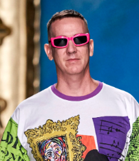
 Jeremy Scott (1975-present) This designer was born in Kansas City, Missouri and grew up on a farm and the suburbs. In high school he sketched in his notebook, his fashion designs and was often bullied for his style choices. He originally applied to FIT after high school and was told his designs were not original. He attended Pratt Institute instead for fashion design and moved to Paris post graduation. He ended up poor in Paris and happened to draw the attention of a PR for Jean Paul Gaultier that liked his hairstyle. He decided to create his own brand, Jeremy Scott, which was composed of whatever fabric he could find cheap, inspired by a dystopian, apocalyptic look. His third collection gave him his start where he started to draw attention from the fashion world. Eventually he took over as the creative director at Moschino, since his ideology lined up with the brand that fashion was a form of protest. Today he has dressed many celebrities including Beyonce, Rihanna, Lady Gaga, and Nicki Minaj. Recently many of his pieces were featured at the MET’s Camp: Notes on Fashion exhibition. Look 46 in the Moschino Spring 2020 Ready to Wear Collection This collection was inspired by Picasso and his muses commenting on the idea of mastery. He pushes the boundaries of what is considered clothing and art. In this collection he truly utilizes structure which gives his pieces a unique amount of dimension. This look was especially influenced by Picasso's famous piece, The Girl with the Mandolin, where he utilizes organic shapes to form the mandolin figure. He contrasts this monochromatic look with bright green painting strokes on the model's sleeked back hair. Look 2 in the Moschino Fall 2019 Ready to Wear Collection He was inspired by the Price is Right and was making a statement on hyper-consumerism in today’s world while reviving the style of the 80s. The styles he shows make a statement with its bold form and color choices. He repeats the imagery of money in this look with the dollar bill dress, green accessories, and heavily decorated neck of precious metals. Not only does this look hold the glamour of the 80s, but the silhouette of the low cut dress, ruffled skirt, and big hair lock in the vintage style. Look 24 in the Moschino Fall 2020 Ready to Wear Collection Inspired by the 1780’s, many pieces in this collection included large hoop-skirts and many images of cake. He compared the turmoil from the time of Marie Antoinette to the current political state around the world, which consists of a strong rebellious feeling. In an interview he mentioned the protests in Hong Kong, Chile, "the sh*t goin' on" in the US, and Brexit as some of the most major political events around the world currently. This look features a blue and white print that depicts nature which is associated with French style. The silhouette is also drawn from 1780's France with the high emphasis on the hoop skirt and the stacked hair, a signature from that point of time. I first learned about Moschino through the Vogue instagram and have been following them ever since. Recently I’ve gotten more into high fashion and have been interested in the way that designers make something that can be worn as art but also communicate their own embedded message. I definitely want to include my own messages in my work and may try to even make my own clothes. I like how Jeremy Scott pushes the boundaries and makes everyone question what fashion really is and what is beauty. If I do fashion next year, I'm going to need to work on my sewing skills and 3D proportions of the human figure. Also I would probably do more wearable sculptural pieces similar to the piece from the spring 2020 collection, instead of clothing. I like how he pulls in common images from pop culture and over emphasizes it in order to make whatever statement he wants. 3-10-2020
I chose to paint two pairs of glasses, one red the other blue, and some gold foil in the background. At the beginning when I was doing the first charcoal sketch, it seemed much more simple to me. There was a lot of detail so I zoomed in my composition to simplify it. Sketching was easy until it came to the Brunaille underpainting, which was much more difficult. Figuring out the values of the sunglasses was not as difficult as getting the texture of the foil. Whenever I try to paint the foil it doesn’t look like foil, then I get lost of where I am and what I’m painting since the background is so abstract. Once I get lost I get frustrated, then give up on trying to make it exactly as I see it, then I eventually get in a slight rhythm and find myself trying to be a perfectionist again which starts the cycle all over again. My point is the foil is hard to paint if you’re a perfectionist which I tend to be. I’m slightly regretting choosing to paint the foil but if you take a step back you can start to see the foil texture which is what really matters. Hopefully, once I add in the highlights, I can really nail down that foil texture. I still need to work on the dark values and I may be able to finish the highlights by the end of the week. Right now I’m happy with the big foil shape in the left since it adds some emphasis but I still need to work on the foil texture that comes through the glasses and that is under the glasses. |
Hanna NgaiHi, I'm a senior at Maggie Walker in Art 5 and I'm an installation sculpture artist that turns plastic bags into art. Archives
May 2022
Categories |
 RSS Feed
